Dark Patterns: Psychological Manipulation in Digital Design and How to Spot It
GenZ Frontier Editorial | August 17, 2026
Dark patterns are interface or service-design choices that confuse, pressure, hide, or steer people toward actions that may conflict with their informed preferences. Examples can include hidden fees, difficult cancellation, preselected options, disguised advertising, confirmshaming, forced continuity, and privacy settings that make refusal harder than acceptance.
Persuasive design is not automatically deceptive. A clear product explanation, a visible recommendation, or a convenient default can be ethical when users understand the choice, can refuse without friction, and are not misled. The key questions are clarity, symmetry, consent, disclosure, reversibility, and whether the design obstructs an informed decision.
Safety and legal note: This is general consumer information, not individualized legal advice. Consumer-protection rules vary by facts and jurisdiction. If a purchase or account issue involves significant money, identity theft, or fraud, contact the relevant company, payment provider, regulator, or qualified professional.
The short answer
A design may be a dark pattern when it:
- hides the total price until late in checkout;
- makes subscribing easy but cancellation unusually difficult;
- preselects data sharing, insurance, tips, or recurring billing;
- uses shame or alarm to make refusal feel immoral or unsafe;
- disguises an advertisement as independent content; or
- uses confusing language to make the business-favorable choice appear like the only option.
One inconvenient screen is not enough to establish intent. Look at the full flow, the information provided, the symmetry of choices, and whether the user can correct or reverse the decision.
For broader digital pressure, read Social-Media Manipulation and Emotional Pressure.
Clear choice, persuasion, and dark patterns
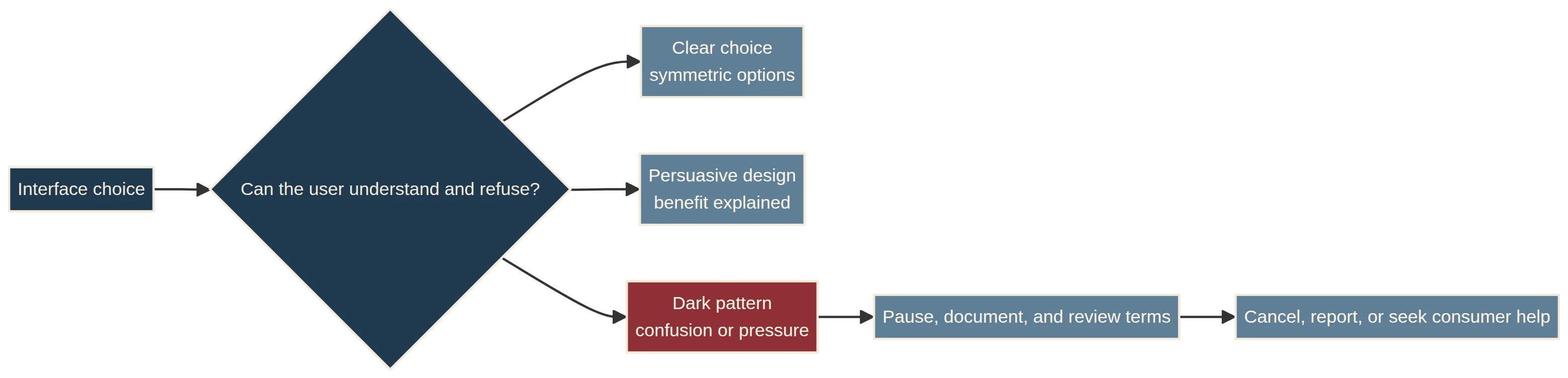
| Design approach | What it may look like | User experience |
|---|---|---|
| Clear choice architecture | Options, costs, privacy effects, and refusal paths are visible | The person can decide with meaningful information |
| Persuasive design | Benefits, recommendations, or reminders are presented clearly | The person can accept or decline without deception |
| Dark pattern | Confusion, pressure, concealment, or asymmetry favors the business | The person may act against an informed preference |
The goal is not to eliminate every influence from design. It is to identify when influence becomes deceptive, coercive, or unfair.
Common dark-pattern categories
Hidden costs and drip pricing
A service may show an attractive starting price and reveal mandatory fees only late in checkout. Before paying, review the full total, recurring terms, taxes, delivery fees, and refund conditions.
Difficult cancellation and forced continuity
A trial may be easy to start but require several screens, a phone call, or a confusing route to end. Save confirmation of cancellation and check future statements when safe. Do not keep clicking through a flow that adds new charges without understanding the terms.
Confirmshaming
A refusal button may say “No, I prefer to waste money” or use guilt to make declining feel foolish. A user should not have to accept tracking, a subscription, or a purchase to avoid humiliation.
Preselection and privacy pressure
Boxes for marketing, data sharing, recurring billing, or add-on insurance may be selected in advance. Check what is selected, what is optional, and whether declining is as clear as accepting.
Disguised advertisements
An ad may resemble editorial content, a neutral review, a system warning, or an ordinary navigation button. Look for sponsorship labels, the source, and the destination before clicking.
Misdirection and visual hierarchy
Color, size, placement, and wording can make one option prominent while hiding the alternative. Visual emphasis is not automatically deceptive; the concern is when the design obscures a material choice or makes refusal unusually difficult.
Where consumers may encounter them
Dark patterns can appear in ecommerce checkout, app subscriptions, privacy dashboards, cookie notices, gaming purchases, comparison sites, financial products, donation flows, and account-closure pages. They may affect money, data, time, attention, or consent.
A design that encourages a purchase is not necessarily a dark pattern. Check whether important terms are understandable, whether the user can leave without penalty, and whether the business has made the less profitable choice needlessly difficult.
Safer consumer steps
Pause before accepting a trial, recurring charge, data-sharing request, or high-pressure offer. Read the total price and renewal terms. Take screenshots of important screens, confirmations, and support conversations where lawful and safe.
Use a direct route to account settings or the company’s published support channel rather than trusting a pop-up. Review bank or card statements for unexpected recurring charges. Contact the payment provider promptly if you see unauthorized activity.
Do not provide passwords, one-time codes, or sensitive identity information to a pop-up or unsolicited message. Navigate to the official website or app independently.
If a service will not honor a cancellation or appears deceptive, keep factual records and consider reporting it to the Federal Trade Commission or your state consumer-protection office. Rules and remedies vary; reporting is not a guarantee of an individual result.
For information-pressure patterns, read Paltering vs. Lying and Psychological Manipulation.
Frequently asked questions
What are dark patterns?
Dark patterns are design choices that use confusion, pressure, concealment, or asymmetry to steer people toward actions that may not reflect their informed preferences.
Are dark patterns illegal?
Some designs may raise consumer-protection concerns, but legal treatment depends on the specific facts, claims, disclosures, harm, and jurisdiction. This article does not make an individualized legal determination.
Is every default option a dark pattern?
No. A default can be useful when it is visible, understandable, easy to change, and not used to conceal a material consequence. The concern grows when the default benefits the business and refusal is hidden or obstructed.
How can I avoid dark patterns online?
Slow down, check total costs and recurring terms, review preselected boxes, look for the real cancellation route, verify advertisements, save confirmations, and use independent official channels.
What is confirmshaming?
Confirmshaming is wording that uses guilt, embarrassment, or insult to make a person accept an offer or avoid declining it. It is a common example of emotionally coercive interface language.
Final takeaway
Dark patterns turn ordinary digital influence into a problem when a design hides important information, makes refusal harder than acceptance, or uses pressure to obstruct informed choice. The practical response is to pause, review the full terms, document important screens, and use official consumer-protection channels when necessary.
You do not have to accept a purchase, subscription, data request, or recurring charge simply because a screen is designed to make refusal uncomfortable.
References
Canonical URL: Open the canonical article page